Friday, December 7, 2012

Anamorphosis Drawings

1. Describe the process you went through to change your object into the correct perspective to create the drawing. This is when you were in the lab.
Using photoshop, we changed the scale of the drawing to make it bigger on top and smaller on the bottom, so that when you looked at it in the right Perspective, it looked like it was coming off of the page.

2. How did distorting and stretching the object allow for you to create a drawing that would look different to the viewer?
By stretching the object, it made it look like the starbucks cup to look like it was coming off of the page.

3. What were the most important concepts in the project to make it successful
You had to make sure that you used your Colored Pencils to create different values  to make it look more realistic and add Shadows as well.

Stencils

1. Explain how you changed your photo in the lab to create a stencil.
Using Photoshop, we changed the picture into Threshold to see the negative/positive space what parts of the picture we should cut out when we transferred it over to the posterboard.

2. When creating the collage background explain your choices of colors, materials (magazine paper, books pages, etc), and placement. How does it relate to your topic? If no relation discuss general idea.
For the background, I ripped up the pages of an old book and a map because the arc de triomphe is a historical landmark, and when I think of history I think of books and maps. After I had mod-podged the book pages onto the big piece of paper, I painted over the pages with brown watercolor paints to make the pages look more stained looking. When it was time to Spray Paint the Stencil onto my Collage, I used blue, yellow, and purple to make it look like the night sky.
3. Discuss the way positive and negative space was used to create your stencil.
After we used Photoshop to find the negative/positive space in our pictures, we had to trace the picture onto a piece of paper using the project. I then cut out the spots of the picture that were black.

4. When using the xacto knife, explain the safety procedures, how to use the knife and any challenges you had to overcome while cutting.
When you are using the Xacto Knife you need to make sure that your hand is keeping the picture still in case it slips. I had some trouble using it at first because it is kind of hard to cut curves with them.

5. How was your experience with the spray paint? Discuss how color choice is important, placement of stencil, and any other concepts you noticed while creating this.
I liked using the spray paint because I like the way it goes onto the paper. You have to make sure the colors you choose have good Contrast, you also have to make sure your stencil is where you want it to be on your paper.


Monday, October 29, 2012

Printmaking Project

1.     Describe the overall composition of your artwork (balance, unity, rhythm and movement).
The giraffe is on the savannah at sunset eating from the tree.
  
2.     How did you add texture and contrast to your print? Is this important? Why?
      I added the texture to the bark by cutting out the bark in the tree. This is important because it adds detail to the picture and you can see what the object is. I also cut out the spots on the giraffe to add texture.

3.     Explain how you used positive and negative space to show your image.
         The pink is positive and the blue is negative. I cut out the spots on the giraffe to show negative space. The spots also show the detail.


4.     Describe the craftsmanship of your print. (How good the project is technically crafted)
        I think I needed more paint on this print because of the white spots in the background. On my Carving I think I did very well because it looks very neat. My print was also in the registration which also keeps it in alignment.
 

5.     Were you able to achieve depth by showing a foreground, middle ground and back- ground? Explain.
    I added depth by making the plants larger as you got closer to the giraffe. I also added the sun to the background to show that it is on the savannah.

6.     Explain your experience with Printmaking. What were the obstacles and advantages?
        I really liked printmaking because I really liked carving the image out of the linoleum and choosing which ink I was going to use. I took a printmaking elective at my middle school so I felt like I knew what I was doing. I think the hardest thing was getting the print in the registration marks
 

Thursday, October 4, 2012

Print Sketch Critique

Print Sketch Critique

1. Why is texture so important to have in your sketches?
It is important to have texture in your sketch to add contrast. It also makes the animal and more realistic. It also looks more detailed as well.
2. Why is it neccessary for you to have several references of each animal and each background? Explain.
It is important to have several references of the animal and the background because then you can make the animal more real looking. It also allows you to add texture to the animal as well as the background. It also helped me look at the different ways I could draw the giraffe as well as the different ways I could draw the background.
3. When you look at your sketches are you able to see which sketch is the strongest and will make the best print? How do you know this?
I can kind of see where the strongest print is. I think that my giraffe looks better than the background so I think I might just do a really close up drawing of my giraffe. Because the background looks kind of bland.

Chalk Murals

Chalk Mural Critique

                                                                                                                                                        
1. Explain your experience  working on a team and executing your ideas for the mural.
I thought that my team worked together very well. We were all very open minded and cooperative throughout the whole experience. In the end, I think we did a very good job with our mural. 

2. Explain the importance of collaboration when working on a team.
It is important to work as a team, because then you are all included in the final decision. That way, everyone is happy while you are working on your project instead of arguing the whole time. Also, everyone is doing something so that you finish the project sooner.

 
3.  How successful was this project? Explain how and why.
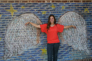
I think our project was very successful because we all worked together in deciding which drawing was going to be the mural and we also agreed on which colors we should use. We also added color and texture to the wings to make them look more realistic. We blended different shades of blue to the background and that really made the sky kind of pop.

4. Explain how you feel about creating artwork that others can interact with. Ex. Invoving the whole school? 
At first I was kind of nervous about the whole school seeing/interacting with our mural because I wasn't sure how people would respond to all of these drawings in the courtyard. But after I saw the different drawing strengths of the people in my group, I felt much more confident about our mural. Over all I think that everyone will enjoy interacting with our mural. :)

Thursday, September 20, 2012

Value Portraits

.
1. Explain the process you went through to develop your drawing.
      First, Mrs. Rossi took a picture of me and printed it out for me to trace over where the light hit my face. Secondly, I put tracing paper over the picture to trace the values of my face. After I was done tracing the values of my face, I had to scribble on the back of the tracing paper in order to transfer my drawing into my sketch book. After I was done with that, I went back and traced over my face all over again to transfer it into the sketch book. Once everything was all transferred, I had to shade the values of my face.
 
2. Explain how you found the different values in the portrait?
     So basicly, I held the picture of my face up to the window with the tracing paper on top of it and I traced over the different values. I found the different values by tracing the values and then shading them in according to where the light hit my face.
3.  Did you achieve a full range of the different values within your portrait?  How?
    I achieved a full range of different values within my portrait by holding up my portable value chart to my original picture and I shaded accordingly. I learned that I liked having just regular pencils to draw rather than drawing pencils. Because, I felt that the leads of some of the drawing pencils were very soft and I just liked the regular pencils better for shading.
4. Describe your craftsmanship.  Is the artwork executed and crafted neatly?
   I personally think it wasn't that great and I think I could've done better. I think on some of the values they were a lot darker than they should've been. Overall, I felt it was pretty neat but could've been neater.
 
5. List any obstacles you had to overcome and how you dealt with them.
    One of the bigger issues I had to deal with was my mental outlook on my drawing because, I am a perfectionist and sometimes I have to step back and realize that everything I do won't be perfect. Honestly, I wasn't really expecting to turn out the way it did. Overall I think I did okay on this project.
   

Friday, September 7, 2012

Value Study Drawings


Along with the photos, please write about your experience working on each project. The following questions can be used as a guide. You don't need to answer all the questions...


1. Describe your overall thoughts on the final piece.
I think that I need to work on my color blending skills, but overall I think I did a pretty good job. :)

2. if this was a group project, what was your contribution?

3. How successful do you feel this piece is and why?
I feel pretty successful for the most part, but I think I have some work to do with my shading and drawing skills.

4. What worked about this project? What didn’t work?
This project worked because it was fun to experiment with the oil pastels. I don't think that there were many problems with the project. Overall it was really easy

5. If you were to do this project over again, what changes would you consider making?
I would've wanted more colors to choose from with the oil pastels, because there's only so many color schemes you can make.

6. What was the most difficult part about completing this piece and why?
I think it was hard to figure out where you were supposed to transition into a different color was because, on some of the shapes I drew, each space that I shaded seemed to be too large.
7. What did you learn from this piece?
I learned how to shade and blend colors.